.01 / The brief
Turn a busy manual process into a calm digital system.
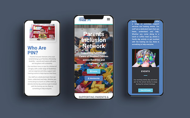
The client needed a website that made support easier to find while removing the admin burden from events and memberships. The existing process relied heavily on manual follow-up, which made growth harder for a small team.
.02 / The approach
Design the journey first, then build the technology around it.
We mapped the main visitor routes, rewrote the page hierarchy around user intent, and built conversion points where people naturally needed them. The design keeps important actions visible without making the charity feel transactional.
.03 / The outcome
A faster, clearer site that lets the team focus on people.
The new system helps visitors understand the service quickly, book into events, and become members without back-and-forth emails. Behind the scenes, the team gets cleaner information and fewer repetitive admin tasks.